ShopDreamUp AI ArtDreamUp

Deviation Actions
Comic Page previews
Support my work by contributing to my tip jar. This tier includes exclusive "behind the scenes" pictures, which means you get to see future Comic-pages before their finishing-touch and more!
$2/month


Suggested Deviants


Suggested Collections


You Might Like…


Featured in Groups


Description
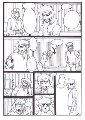
OH MAN THE UPYR KING THAT GUY JUST DOES SOME SERIOUS SHIT DAMNIDY DO
Website is ahead on updates by a week!: colorblindcomic.com/
Next: pablololo.deviantart.com/art/C…
Previous: pablololo.deviantart.com/art/C…
First: pablololo.deviantart.com/art/C…
Website is ahead on updates by a week!: colorblindcomic.com/
Next: pablololo.deviantart.com/art/C…
Previous: pablololo.deviantart.com/art/C…
First: pablololo.deviantart.com/art/C…
Image size
850x1161px 682.68 KB
© 2013 - 2024 DruidTeeth
Comments17
Join the community to add your comment. Already a deviant? Log In
Your use of the colors, movement, proportions and frames are excelent! I like it very much!
Maybe the only problem I have is the text. Personally I'd leave the spaces in blank, and add the text digitally later. Also, this have the future options to translate the comic in other languages <img src="e.deviantart.net/emoticons/s/s…" width="15" height="15" alt="
I like the details you use in each frame. But study other types of frames, is bored when you see just rectangles and squares in a comic strip. Evaluate some professional mangas or comics, you'll see some frames have no border and that makes it dinamics and interesting.
I'd modify the ballon dialogues, they look big, or, I really don't know what word to use, they look weird. And personally are uncomfortable to read.
<img src="e.deviantart.net/emoticons/s/s…" width="15" height="15" alt="