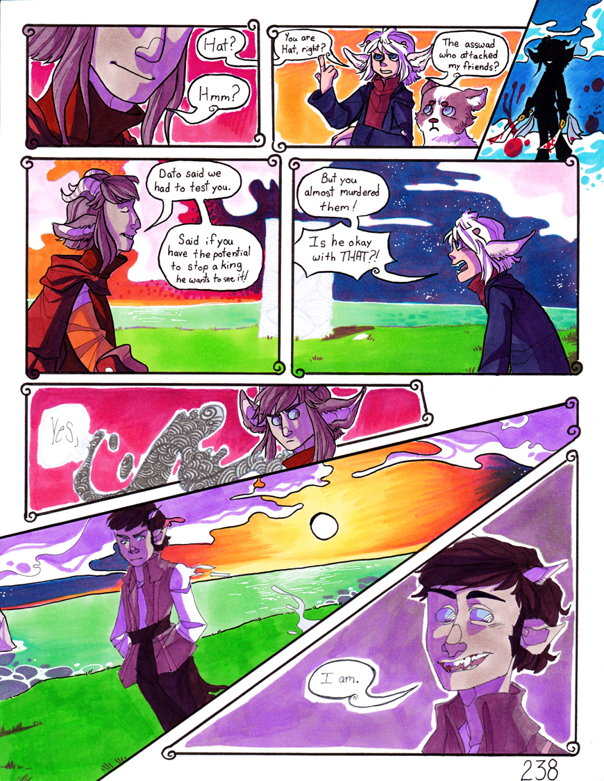
Hi Lucy!
There's a lot to be said for this page. A lot of great work here. <img src="
e.deviantart.net/emoticons/n/n…" width="15" height="15" alt="

" data-embed-type="emoticon" data-embed-id="334" title="Nod"/>
The Good<img src="
e.deviantart.net/emoticons/b/b…" width="10" height="10" alt="

" data-embed-type="emoticon" data-embed-id="211" title="Bullet; Blue"/> Good anatomy / proportions
<img src="
e.deviantart.net/emoticons/b/b…" width="10" height="10" alt="
" data-embed-type="emoticon" data-embed-id="211" title="Bullet; Blue"/> Nice line work
<img src="
e.deviantart.net/emoticons/b/b…" width="10" height="10" alt="
" data-embed-type="emoticon" data-embed-id="211" title="Bullet; Blue"/> Dramatic poses and camera angles
<img src="
e.deviantart.net/emoticons/b/b…" width="10" height="10" alt="
" data-embed-type="emoticon" data-embed-id="211" title="Bullet; Blue"/> Beatiful, vibrant colors - my favorite part <img src="
e.deviantart.net/emoticons/l/l…" width="19" height="19" alt="

" data-embed-type="emoticon" data-embed-id="577" title="La la la la"/> The water is especially cool! <img src="
e.deviantart.net/emoticons/n/n…" width="15" height="15" alt="
" data-embed-type="emoticon" data-embed-id="334" title="Nod"/>
<img src="
e.deviantart.net/emoticons/b/b…" width="10" height="10" alt="
" data-embed-type="emoticon" data-embed-id="211" title="Bullet; Blue"/> Fun, non-conformist paneling style. <img src="
e.deviantart.net/emoticons/b/b…" width="15" height="15" alt="
")
" data-embed-type="emoticon" data-embed-id="366" title="
(Big Grin)"/> I love the bleed to edge on panels 3 & 7 and the illustration escaping the lower border of panel 6.
Things to Improve<img src="
e.deviantart.net/emoticons/b/b…" width="10" height="10" alt="
" data-embed-type="emoticon" data-embed-id="211" title="Bullet; Blue"/>
Watch for Tangents - I think part of the issue with tangents on this page is that the page is a little crowded (I'll mention that a little more below). I see that both of the heads in panel 2 have a bump-up with the panel border or a dialogue balloon. Same thing happens with one ear in panel 6 and the hair in panel 8. It could be argued that panel 7 deliberately cuts the top of the head, but I think it would have more impact if he were fully in-frame - again, I'll talk a bit more about crowding below. Alternatively you could have gone with panel 8 overlapping panel 7, so that the shapes of the panels would better accommodate the figures.
<img src="
e.deviantart.net/emoticons/b/b…" width="10" height="10" alt="
" data-embed-type="emoticon" data-embed-id="211" title="Bullet; Blue"/> Dialogue -
all the dialogue balloons in panels 1-5 have bump-up tangents with something. Don't be afraid to let the dialog balloons escape the panel borders the same way your art beautifully escapes the border of panel 6. I think too, allowing the dialogue balloons to lay on top of the panel borders could be especially helpful when you've got dialogue spanning across multiple panels, like between panels 1 & 2 here - it would look less crowded and I think it would help the reader see the chain to identify the speaker. For example, I had a challenge to make all the dialogue fit
on this comic, and laying it on top of the panels was a big help. How I handled the dialogue for that very last two panels is about how I would have approached your first two panels here.
<img src="
e.deviantart.net/emoticons/b/b…" width="10" height="10" alt="
" data-embed-type="emoticon" data-embed-id="211" title="Bullet; Blue"/> Paneling - I think I would have gone with a single panel instead of splitting panels 4-5. I understand that it helps preserve the dialogue flow, but it's unfortunate that the gutter cuts across one of two gorgeous backgrounds you have on this page. <img src="
e.deviantart.net/emoticons/n/n…" width="15" height="15" alt="

" data-embed-type="emoticon" data-embed-id="556" title="Noes!"/> To be honest, I think your best bang for buck would have been to end this page at panel 6 as a bit of a "cliffhanger" (makes people want to see the next page), and then put 7-8 on the next page. This would have given you more room to make panels 4-5 taller and placed the dialogue above the characters instead of between them and solved the slight crowding issue you've got going on in those 2 panels.
<img src="
e.deviantart.net/emoticons/b/b…" width="10" height="10" alt="
" data-embed-type="emoticon" data-embed-id="211" title="Bullet; Blue"/> Color - Like I said, color is fantastic - easily your strong suit! <img src="
e.deviantart.net/emoticons/b/b…" width="15" height="15" alt="
" data-embed-type="emoticon" data-embed-id="366" title="
(Big Grin)"/> The only place where it looks oddly out of step with the rest of the page is the sun and horizon in panel 6 having that dark border especially after that beautiful border-free pillar and white-lined horizon in panels 4-5.
NitpicksThis is the point at which, the suggestions are for things that are pretty minor and I might not even notice them if I weren't looking for things to critique.
<img src="
e.deviantart.net/emoticons/b/b…" width="10" height="10" alt="
" data-embed-type="emoticon" data-embed-id="211" title="Bullet; Blue"/> Colors - like I mentioned, my favorite part of the piece, so there are only a handful of things I can mention as areas of improvement. The eyes in panel 2 seem a little too dark (if you can get a finer line in the line work on the face at that distance - like the lines in the last panel - it might help). Blue jacket is a little tough to read - may be a good spot for a little more contrast. Same with the dark hair on Dato.
<img src="
e.deviantart.net/emoticons/b/b…" width="10" height="10" alt="
" data-embed-type="emoticon" data-embed-id="211" title="Bullet; Blue"/> Paneling - I think the background colors should probably meet the edge on most of the panels, except certain specific spots where it really helps with the contrast like that last panel. The first two panels I think suffer slightly from a bit of a cluttered look because the background colors don't flush to the border of the panel. I think also, while I like the curly corners, I might not make every corner that way. Maybe pick 1-3 corners of a given panel to curl, it'll save you a little bit of time drawing them and may alleviate again a sense of crowding in a few places like where panels 1 & 4 almost touch at that 4-way intersection.
I hope you find these suggestions helpful!<img class="avatar" src="a.deviantart.net/avatars/c/r/c…" alt="

" title="Critoons" />