ShopDreamUp AI ArtDreamUp
Deviation Actions
Comic Tier
2 Subscribers
Burnt out folklorist hides from the world and her antagonist who plumber the outside of her home. Upon receiving a random invite to a cabin from a fan. Mel escapes the drudgery of her life only to find another annoying neighbor who turns out to be fey. Can she survive the encounter or can Mel give him an offer he can't refuse?
This tier has all of Shurale season 1 and 2 Shurale fairytales! Updated every month.
$5/month


Suggested Deviants


Suggested Collections


You Might Like…


Featured in Groups


Description
Next: Color Blind Page 278
Previous: Color Blind Page 276
First: Color Blind Prologue
Website!
Follow on tumblr!
Support me on PATREON!
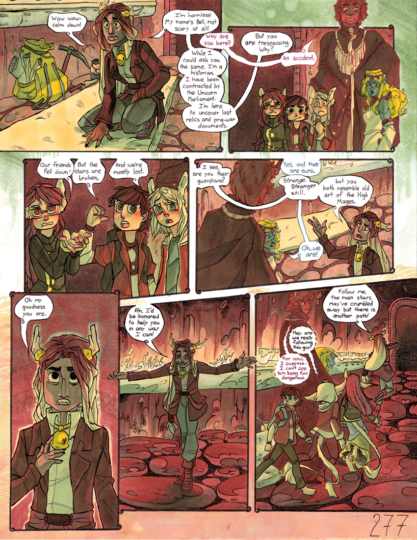
Aaaand we're back!
Previous: Color Blind Page 276
First: Color Blind Prologue
Website!
Follow on tumblr!
Support me on PATREON!
Aaaand we're back!
Image size
850x1100px 957.04 KB
© 2015 - 2024 DruidTeeth
Comments22
Join the community to add your comment. Already a deviant? Log In
At page 277, it's difficult to relate a critique. You've written and published almost three-hundred pages and you've managed to get close to 400 views per page currently. That is a mark of success w/out a doubt. That's important to recognize! What I have to say here are recommendations on improving some aspects of what is already working and by no means meant to come across as a heavy-handed assessment.
This being the case, I look for the same qualities in each page that I read. They are, most commonly, character design, rendering, lay-out, plot and lettering/text presentation.
Let's look at each one from my own admittedly dogmatic and practical point of view for this one page. Maybe I can compare it with some previous pages in this series.
Character Design:
The humanoid character have an elven and faunish bent to them that is unusual and original. Their wardrobe looks like traditional adventurer garb which works out well due to the fantasy setting of this comic. I like that most of the main characters are usually bare foot or running along on hooves.
I also like the dog that was featured on page 265 and his reactions. The facial expressions are great. That is not easy to do with animals! More on this page later in Lay-Out.
Rendering:
One person webcomics can have a number of issues to master. Rendering highlights and shadows is one of the most intense of them. This aspect is not ignored in this series but it seems like light and dark could be more defined and separated. Panels one and two have some sharp, but dulled, declarations of where highlights are but then that is lost for much of the rest of the foreground characters in the rest of this page.
However, there is some out-standing separation going on in the background here. The flames and highlights in the background do a great deal to make the characters "pop" in the foreground. My criticism is that there is not enough of the background lighting effect that is striking the characters.
If a group of people were in a cavern and lit by a large central light source there would be pronounced shadows and highlights - even taking into consideration the reflected light from bounced light. But that is not consistent on in this page. The clearest we see a realistic lighting effect is in final panel - panel seven. It works because we can clearly see which are the darkest parts of the background. Panel six shows this to a lesser degree but this effect needs to be more pronounced as well.
My suggestion would be to push the lighting and darken the shadows. This would prevent the colors from seeming flat and cartoonish. It would add
Lay-Out:
Some artists are big fans of very consistant lay-outs. Nine panel pages (Watchmen) or a "go-to" set of lay-outs (Kirby) to fit all situations can be handy for getting a large amount of action and plot across. This being said - I like that this comic doesn't subscribe to either of these methods. I like that sometimes the action can be featured and expanded in an over-sized or irregularly shaped panel.
One of my favorite pages is 265 where the action is so intense that each panel is rocked and fragmented. After a few weeks of intially seeing it I'm still very impressed by it.
The ability to adapt the lay-out to the action is a strength of this series.
Plot:
Having only read a few dozen pages it hard for me to grasp the totality of the narrative structure. I understand that there is a long-running quest through a fantasy setting but I'm unclear why or for what at this point. This is a failing of my own for not having enough time to read more of this comic.
Lettering/Text Presentation:
Text is crucial. It cannot be over-stated. Without being able to clearly read it the reader is lost. The best examples I can think are Moebius's work. Although there was a great amount of strangeness happening all around - the text (albeit translated) was always presented in a large, clear and well-spaced method.
My problem is that the text is crammed and shifted around on these pages. I understand that this is a traditional comic and not a digital one but this approach is making the text very hard to read. By shifting the speech bubbles into corners and edges as seen in panels three, four, five and six it makes the text a low priority.
My lettering suggestions are to, whether traditionally or digitally:
1. Double the size of the speech bubbles.
2. As seen in panels one and two plot the space for the text in a way that flows.
3. Reduce the amount of dialogue to the most critical points.
4. Think about using more exaggerated expressions. Look at common expressions in anime/manga to display reactions (tear at the side of head, sweat, bloody nose, chibi/spoof).
This can decrease the amount of dialogue by a great deal.
I hope this critique gives you an understanding how I've read your comic. Keep up the good work.